


“If they can dye this river green today, then why can’t they dye it blue the other 364 days of the year?”
-Deputy Marshall Robert Biggs, The Fugitive–

If progress begets progress, it would make sense that improved progress begets improved progress. Following the improvements to my version of the CRANDIC’s lattice-truss bridge over the Iowa River, other elements in the overall scene required similar updates. Most notably in the transition between the three-dimensional foreground and the two-dimensional background.

As with most of the photo backgrounds used on The Hills Line, the images of the Iowa River were taken from Google Streetview and built as a collage. Fortunately, the shots available included an excellent reflection of the sky in the water, which helped make the scene appear as it went on for miles and miles.
However, that exact reflection became a hindrance when trying to blend the transition between foreground and background. Despite not possessing the artistic talent that my friend and fellow Iowa Interstate modeler Scott Thornton has, I attempted to blend the two areas together using a variety of acrylic paints in a style similar to what he had done for the Rock River crossing on his IAIS Milan Branch layout.

The result was precisely what you would expect it to be.
I knew that at some point in the future, I would be replacing the bridge itself with a hopefully more accurate and less sloppily constructed version. That process would probably include a second attempt at the backdrop transition. Therefore, I decided to leave that project for “future James”.
Two years later, the future was here.
Unfortunately, in that time my artistic skills had not progressed. However, I was able to realize this fact well ahead of attempting any sort of pigment-on-paper process. That led me to a method I know I’m comfortable with… photo manipulation.
Using Adobe Photoshop, I applied a partially transparent color gradient over the river portions of the scene. I matched the RGB values of Behr’s Wild Rice paint, which I use as my base color for all scenery, as the starting hue of the gradient. It was then applied so that the bottom edge was fully opaque but trailed to nothing as it moved up the image. After all, I didn’t want to remove those beautiful reflections.
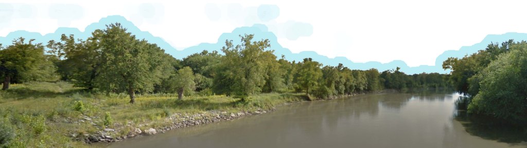
The result was a tinted image that helped ease the transition between foreground and background. I was careful to limit the effect to the water portions since I had already spent considerable time on the ground and grass to match it between photo and scenic materials.

The new backdrop was installed into the scene and touched on the edges. This time, I first applied the Golden Gel I use for water and allowed it to fully dry before adding the Wild Rice paint atop the waves. I also went as slow as possible when applying the gel and the paint to avoid repeating my mistakes from going too fast the first time.
From shallow and wide to narrow and deep, the waters once again roll uninterrupted on The Hills Line.

Brilliant! Looks amazing, really smooth transition.
LikeLiked by 1 person
Looks good so far. Hope you’ll post a follow-up photo of the scene after everything dries.
LikeLiked by 1 person
James … this is absolutely stunning ! Terrific example of playing to one’s strengths to overcome obstacles … very well done .
LikeLiked by 1 person